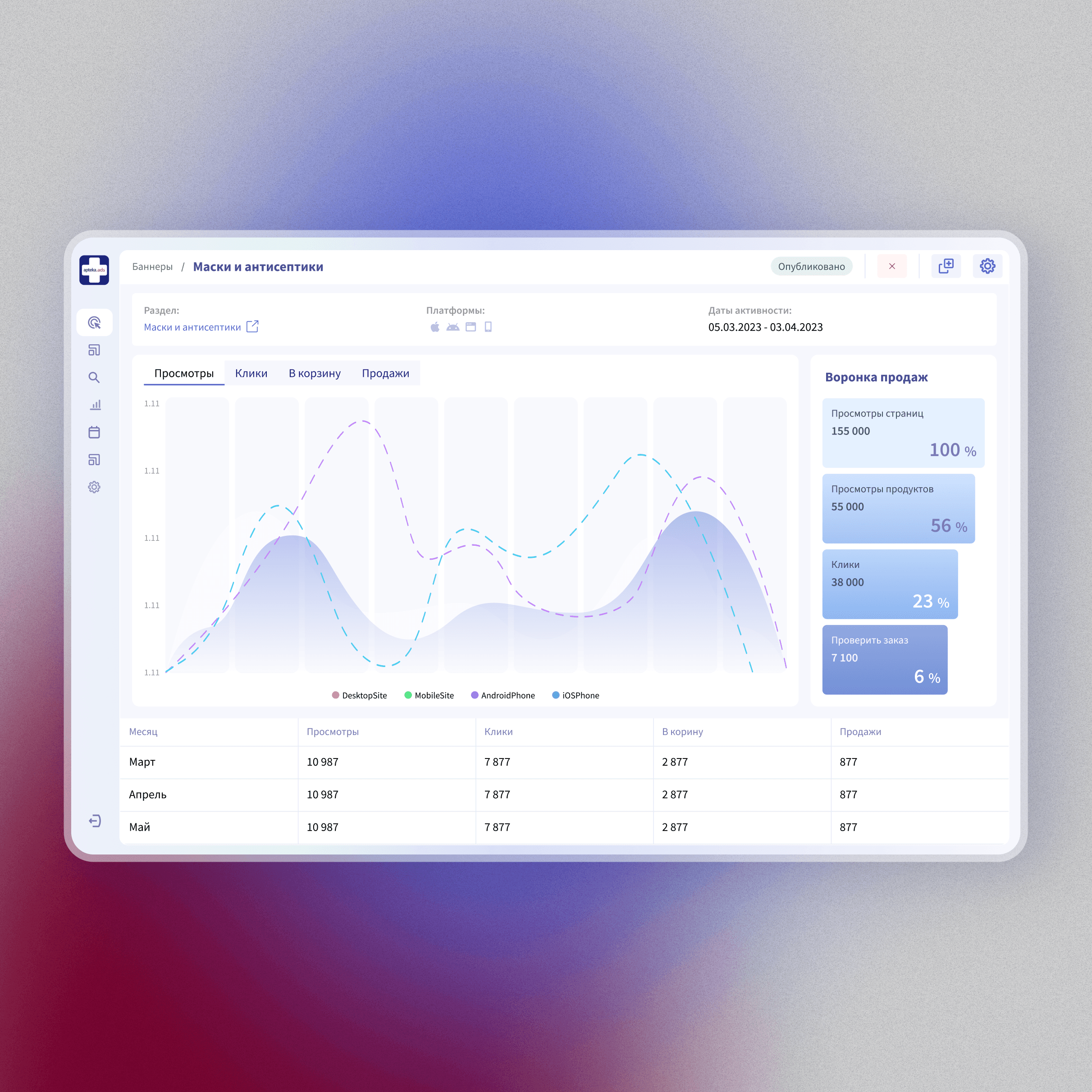
Admin Panel Design System Adoption · Apteka.ru
The company's first internal product, grown to 9 sections and 40+ modules without a design system. I Led the unification: audited every pattern, introduced the design system, and rebuilt the product the team uses every day.
Scope
Design system initiator, architect & owner / Interface audit, pattern unification, quality control / Junior designer management
Client
Apteka.ru
Duration
Ongoing
2025

Context
The admin panel was the company’s first in-house product. It was created at a time when there was no design system, no established templates, and no single person responsible for the overall user experience. Over the years, it grew to include 9 sections and more than 40 modules, each of which was added as needed. Some modules were launched without the involvement of designers; others were created by different people at different times, and no one was responsible for the big picture. The result was a product that evolved through incremental additions. Each section followed its own logic. The product worked, but it was becoming increasingly difficult to use, and expanding it without making things worse was even more challenging.

There was also a second, structural aspect to the problem. Apteka.ru’s internal tools do not exist in isolation. Features migrate between products. A module created for the admin panel might later be moved to an advertiser’s personal account or to the supplier portal. In practice, each such migration meant not just adapting the layout, but also manually replacing components with their equivalents from a completely different set of interface elements. The visual similarity between the products was deceptive; “under the hood,” they had nothing in common. Each migration was slow, costly, and fraught with the risk of introducing new inconsistencies.

Building the design system
The migration problem became one of the main reasons I initiated the creation of a design system. Since we weren’t under any time pressure, but needed precision and flexibility tailored to our tasks, we decided to build our own system rather than adopt an existing one.
The idea was to first test the concept in practice and only then present it to the team. At the same time, we were working on creating the Advertiser Dashboard and decided to make it a pilot project: We created a prototype UI kit; at this stage, it wasn’t yet synchronized with the code, but the design was conceived from the outset to be universal, every “atom” and “molecule” was created to be versatile across the entire product family, and the styling was fully implemented using color tokens, allowing the same components to be used in different products simply by switching the color scheme. We then used this UI kit to build another small product and reached the point where our concept had proven its viability.

With two real-world examples in hand, I presented the project to the head of development: here’s the problem, here’s what already exists, and here’s the implementation plan. He approved it.
Next came the time for painstaking work, we finalized the component library with feedback from front-end developers at every stage, established a process for adding new components, coordinated the implementation, and launched an internal site where the entire company could review the guidelines and work directly with the components; we also tracked the progress of the rollout using a component adoption map across all products.

The system was rolled out across six internal products within six months; the work was carried out in parallel with regular product development, rather than as a separate initiative, and without a dedicated team. The system’s advantages were most evident when we needed to simultaneously replace the authentication module across all products; all it took was copy-pasting and switching modes. No customizations were required for individual products.

As soon as the system was implemented, the next natural candidate was the admin panel: the oldest and most convoluted product in the ecosystem, which would benefit the most from adopting a common visual language.
Admin Panel Redesign
We started with the most visually obvious sections: the main pages of sections consisting primarily of tables. Here, we could apply the design system components immediately, and the results would be visible to the entire team without delay. Completing these tasks quickly and correctly allowed us to create a clear “before and after” contrast and reinforced our confidence in the chosen approach.

Next, we conducted a systematic audit of the internal pages: form builders, entity creation processes, moderation interfaces, and views with a large number of filters. Everything was captured in screenshots and categorized, we compared all variations of each template, which had gradually diverged over the years. Based on this, we developed standardized templates for each interaction category, tested them on the most structurally diverse examples we could find, presented them to the team, validated them through “walkthrough” tests, and refined them. We then worked through the entire product section by section, redesigning each page using the design system components.

In practice, during the detailed work, issues arose that weren’t covered by the standard templates. One example: during implementation, we realized that the delete button would be better placed in the settings panel rather than within the entity’s body, it’s a small detail, but on a large scale, it’s precisely these details that make up usability.
The result
The product has evolved from a homemade collection of disparate solutions into a cohesive and easy-to-maintain system. New features can now be designed and built based on an established visual language, rather than having to be invented from scratch each time. Data transfer between products, the problem that started it all, now takes significantly less time than before. While there aren’t any spectacular metrics here, the qualitative shift was significant and noticeable to everyone who worked on the product on a daily basis.