APTEKA.RU WEBSITE
Russia's #1 online pharmacy by order volume, Data Insight Top-100, 60M+ orders/year. Built the team's UX analytics practice from scratch, turning every interface decision into a measurable one. This enabled a redesign that lifted conversion by 5% and improved perceived appeal.
Scope
Design lead · UX analytics system owner / Design & visual direction / A/B testing strategy & perception benchmarking
Client
Apteka.ru
2026

Context
Apteka.ru’s top business priorities have always been product variety and delivery speed, so our main focus has always been on internal tools. As a result, the service’s website had been quietly accumulating “debt”. Visual, structural, and related to the user experience. By the time we noticed this, the gap between us and the market had already become significant.

On top of that, we had data. A few years earlier, I had set up a UX analytics system, and by this point, it was providing us with a constant stream of information about how users perceived the product and interacted with it.
It included web analytics, monitoring of support requests, in-app surveys, and our own A/B testing infrastructure. All of which enabled us to tackle the major task of redesign.
We conducted a survey on perceived characteristics, which showed that 39.5% of users rated the site as “modern” and only 14.10% as “attractive.” Similarly, a survey on the homepage revealed that 64.7% of users cited advertising banners as the first thing they noticed when visiting the site (rather than the search bar or content.)
Navigation
The trigger was a request from stakeholders, phrased in general terms: “Make the search bar more noticeable.”
However, armed with data and relying on our intuition, we decided to use this task as a starting point for a structured rethinking of the navigation and visual language of the entire site.
Instead of jumping straight into visual changes, we started with the structure. We tested 3–5 different navigation concepts and conducted walkthrough tests with real users to evaluate each one.
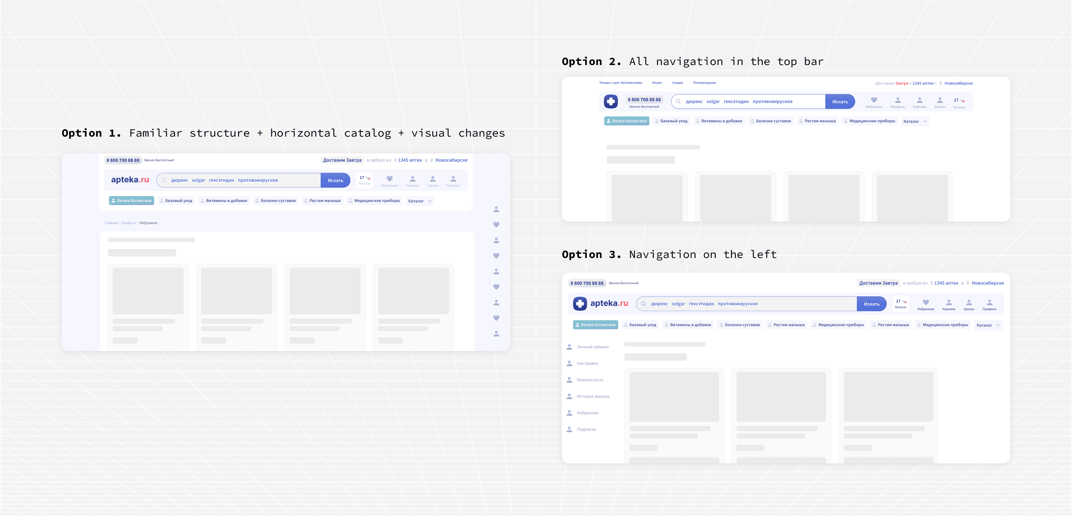
The final version turned out to be closer to the existing structure than the more radical concepts we considered, but it included a number of targeted changes that yielded tangible results. The sidebar catalog was moved to a horizontal navigation bar directly below the site header, which significantly improved access to product categories. Information about the loyalty program, promotions, and discounts was moved to the header and highlighted with visually striking, bright icons, making it much easier to find. The pickup window for orders at the pickup location was also added to the header. We knew users had requested this feature based on our monitoring of support inquiries, and working on the navigation provided the perfect opportunity to incorporate it into the project.

And here’s a small but effective detail: the display of the current city and the link to nearby pharmacies were combined into a single compelling phrase: “We’ll deliver today to any of X pharmacies in [city],” transforming a functional element into something that truly conveys the product’s value.

Visual direction
Once we’d resolved the navigation issue, we moved on to the visual language. The process began with research into the Russian e-commerce market. We investigated what the current leaders in various categories are doing, the direction in which visual trends are heading, and what’s already starting to look outdated. We explored 3–5 directions before settling on a concept based on three interconnected solutions: a transition from flat iconography to pseudo-3D to add depth and a tactile feel; expanding the color palette beyond the brand’s signature shades of blue by adding green tones borrowed from the “Katren” brand’s visual identity; and a richer, more layered gradient system that gave the product a sense of depth it previously lacked.


Results
We launched an A/B test with four variants: the old and new designs, each with and without changes to navigation, to isolate the impact of structural changes from visual changes. Based on 10 million sessions, we found that the new design delivered better results: the conversion rate was 16.98% compared to 16.15% in the control group, representing a +5.1% increase. The registration rate rose from 0.90% to 0.95%. The average order value remained stable throughout the entire period.
We then conducted another perception survey using the same questions as in the initial comparative analysis. The percentage of “Attractive” responses rose from 14.10% to 16.69%, representing an increase of +2.59%. The percentage of “Outdated” responses decreased.

The successful update to the navigation and visual language paved the way for the next phase of work: we were able to transition from the random page layouts that had accumulated over the years to a unified 4-column grid across the entire site. The product detail page, historically one of the most structurally complex and commercially critical pages in the product, has been completely redesigned and is currently in development.

On the role of the analytics infrastructure
It’s worth noting that none of this work would have been possible without the analytics system we built. The data on perceived characteristics existed because I had created a survey infrastructure and started using it even before it was needed for any specific task. Our understanding of navigation patterns came from monitoring support requests, a system we built and configured ourselves, which we enriched with platform data to distinguish between issues in the web version and the mobile version. A/B testing was conducted on our own internal platform.
This project is a clear illustration of the opportunities that arise when measurement infrastructure is treated as a design element.
By the time decisions need to be made, the data necessary to make the right choices already exists.